

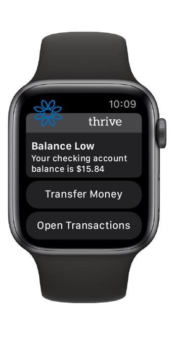
A Watch for Banking
While at Q2e Banking one of my primary goal was to come up with ideas about how a bank can use something as small as a watch to interact and market to customers. These ideas were meant to be used during Q2es annual convention for 2020, which ultimately ended up being canceled due to covid.


jetBlue happyFlyer Program
Flying is something that nobody enjoys anymore. Right before I started this academic case study, I had just gotten done taking my family of five to Disney World, and I had to horrible experience flying out of Orlando International. Getting kids through security, babies crying, people complaining about them having to listen to a baby cry, and all the other little things that make flying a nightmare. So, I thought “Why does it have to be this way and what can we do to make it better?” With today’s technology, we can leverage machine learning and Ai predictive systems we can use software to make decisions that are better and what a user can. Not only because we can use Ai but also because it is assumed that the app will have access to more information than a user will. Is the user a twenty-something who hates kids? Well, we better not seat them next to the family of five with two babies.
The main problem we face is the many time's people A. Do not know what they want, and B. Are extremely finicky and moody. So, for this study, I was trying to find a happy middle ground the will make anyone’s flying experience better via satisfaction studies.
I tried to keep the applications of this program as broad as possible. We aim to help anyone that flies on a plane. But throughout the study, it became apparent that doing this for that large of a group was not going to work within the time frame that was given for this academic study.
For this study, I was the only person working on it. I had to go through all the education, research, prototyping, high fidelity mockups, and then finally user testing. The two significant constraints that I had to overcome were the initial scope of the study is way too broad and problems finding subjects for user testing.

The first step I took was researching what if anything could be done to make flying better. This research led me to create a value proposition so that I can nail down what needed to be fixed.

So, after finding out what I needed to nail down, I conducted some interviews with a few frequent flyers I moved on to creating a persona of who our hypothetical flier is and a process path on how we would achieve our goal.

Now I know who is our average user and the path that we want them to take; I moved into mockups that started with sketches in a notebook and to a low fidelity model. This is the time where I realized that the scope of the project was too broad to work. After some ideation on the subject, I figured that if I can’t help everyone that flies down to someone who flies with one particular airline. After looking at the current significant airlines that operated in the United States to find a proper fit for the project. This led me to rebrand the study to be a member rewards system and a way to keep the airline's customers lives better. The only airline brand that I could see doing this is JetBlue, and this led me to finally name the project as JetBlue HappyFlyer program.

Through this process, I was able to see that other small thing that can be leveraged to help make a customer’s life better. For example, I decided that if we do something like leverage google maps API we can do things like telling a customer when they need to leave so that they don’t miss their plane, show them the fastest way to the airport, or tell you were to park your car so that your closest the terminal. In retrospective, I was also able to see some other small areas that could use some love such as connecting the app to ride-sharing services such as Uber or Lift and the ability to help users to fill out the precheck paperwork so they can skip the security line. I still believe that if I could make this study into a real-life product, it would really improve flier lives.
Notes for Audiobooks
Inside this academic case study, I was given the task of finding some way to improve an already well-represented app. For this, I had to ideate on the problem for quite a long time. I finally took the idea to build something that would help me personally. I have lived with dyslexia for almost my life. As far back as I can remember I had trouble reading and would reverse entire paragraphs while trying to read them. Because of this, I have had to adapt and find tools to help me along, or I would never get anything done. For the majority of reading that has any length to it I have to either listen to an audiobook or have my phone dictate it to me. Like many other people who listen to audiobooks, I use audible as my way of getting audiobooks. So from that point, I had to figure out what I could do with audible to help the dyslexic community.
Because of this, I had to jump ahead in my usual process and started with interviews first. I gathered everyone I could find that uses audible and is dyslexic. From these interviews, I found out that some people needed a way to make notes from a text that is being read to them. I ended up leaving the interviews knowing what needed to be fixed, but I wasn’t sure how to proceed from there.
Lighting stuck one night when my oldest daughter asked me to fix her Amazon Kindle that was actually a hand me down from me when my wife got me a new one. As I was fixing her problem, I saw a little button and then I remembered that Kindles not only use to read to you in a horrible monotone computer voice but kindles also could highlight things through amazons whispersync system. Simply put whispersync is a system that keeps all devices that are reading from a kindle or being listened to via audible and syncs things like your notes, highlights, or last position in the book you were reading or listening to. Then the lightbulb went off if you can highlight and make notes on a kindle but why not the audible app.


Examples of Amazon Kindles note taking system.

Persona
After this process, I went back and made a persona for the type of people I was trying to help. I actually ended up based on my good friend Sam who was in the same predicament as me. He was also one of the people that I interviewed for pain points.
Imagine you’re listening to one of your favorite novels via the audible app, and for some reason, you need to make a note or highlight a very important passable that you want to remember for later on. I know I personally already use my smartwatch to control things like volume, pause, play, or fast forward. So, I decided to start with an Apple Watch for the notes and highlights. Then it dawned on me that since we are using Amazons whispersync, which already has a social function inside its highlights and comments, we can easily tie what we are building with the same social function so now we not only will be able to make notes in audible but also be able to share those notes.


Sketches
After making some rough sketches, I moved through wireframing at a rapid pace due to lack of time remaining until the case study was due. The final outcome always was made with the idea that I would start with the watch and if it ever became available I would or needed, I would flesh out the phone side of the app to help with note-taking. For a start, though I thought that the Apple watchOS would be a great proving ground.

Final screen made inside sketch with iOS and watchOS asset packs.
This is an example of what I finally came up with. As you can see on top, you have the phone version of the Audible app. On the bottom row, it shows how the watchOS note-taking system. Like most watchOS apps they are companions to the larger version. A place where you can skip forward, pause, play, turn the volume up and down, and finally make and share notes. On screen number three you can see an example of a shared note. When you get to the part of the story were the note was made then the note will show up on your watch till you get to the end of the area that is highlighted. As far as how someone would actually highlight and note down the part of the story is the listener would click the red button to start highlighting. Then the story gets to the area where the listener wants to stop the highlight, they would press the same button again. Then they are prompted as to if they're going to add a comment to the highlight just leave is as it is. For the actual comments, I decided to leverage the watchOS dictation skill since typing or scribble on a screen that small is amazingly frustrating.
Overall I do think that the idea is very rough, still needs work, and testing is users, but for only having two weeks to do everything I think what I came up with was an excellent starting point that I hope to expand on one day.
Web Design
This example site was built to showcase what can be done with a very simple and small page layout in a e commerce space. The site is active and works, you can go though payments but no payment will be taken as the system is set to a test mode.
Welcome to the captivating world of Shadows of the Bamboo Forest, where minimalistic elegance meets the mystique of ancient Japan. Our one-page website is a visual masterpiece that immerses you in the essence of samurai valor and ninja stealth. The monochromatic palette of black and white paints a canvas of sophistication, mirroring our signature shirts and hooded sweatshirts. As you explore the site you are transported you to a realm where Bushido principles come alive. Scroll through our curated collection, each garment echoing the spirit of the warrior tradition.

Below you can see a prime example of one-page design. This site was built for a client who is a home inspector. When I first met him, he had no logo, and his website was a massive mix of domains and websites. None of the sites were professionally designed and had no connection to one another. I consolidated all of his domains to one site design and brand new logo. The client noted a massive uptake in sales after the site's deployment.

Site was built for a client that is a martial arts instructor for the city of Temple Texas. The site continues to receive accolades and has even been called "The best looking dojo site made".

The following site is part of a academic redesign and rebrand of the Redbird flight simulator company located in Austin Texas. The site complimented designs for corporate swag, new logo, new site design, and new brand guide.

Graphic Design
These are examples of my graphic design work. Ranging from print design, visual design, clothing design, and even some illustrations.


UI Design
These are examples of my UI design work. These are all examples of me doing layout and setup of a UI but are not examples of my UX Design.


ICONS
These icons were made during my time at Q2E to expand the companies icon library.
